
Cramped kitchens. Dated finishes. Design choices from bygone eras. Spokane's heated home market may demand that buyers in search of a bargain learn to see past a home's shortcomings, and interior designers are ready to assist. In this issue, three local designers tackle '70s and '80s homes that presented significant challenges. See how, in each case, the designer's creativity and skill helped reveal modern livable dwellings, hidden just below the surface. And read on for tips in overcoming your own home's shortcomings.
FROM SOUTH HILL SUBURBAN TO SPANISH MODERN
Design Challenges:
- An overload of ornate trimwork
- Dated light fixtures
- Colorful palette not a match for new homeowner
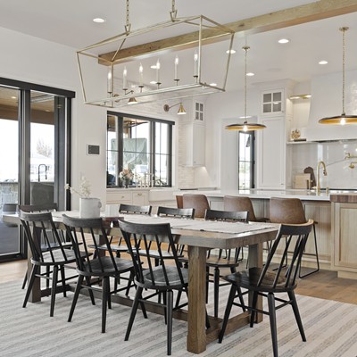
When Jared Lyman decided to move back to his hometown of Spokane after going to college and living in Seattle for 20 years, he wanted a house suitable for entertaining his large extended family. He found a spacious 1987 home on a quiet street in a South Hill neighborhood, complete with a pool in the large, flat backyard. The home's layout fit his needs. The only problem was its current style. The ornate, colorful vibe just wasn't to his taste.

"I bought it more liking the the light of the house," says Lyman, "knowing that I was going to have to do some work but not envisioning that I would have gone to this level."
His realtor recommended he contact designer Erin Haskell Gourde, owner of Design for the PPL. The house had a dated feel, and Gourde says she immediately knew why. The trim. It had to go.

The project involved fairly extensive replacement of the original sheetrock on both walls and ceilings, a messy process, but one that came with a benefit.
"If you're redoing the ceiling anyway, it really makes sense to redo the lighting. New lighting really makes a difference... the lights are almost like jewelry," says Gourde. "Jared was really someone who knew how important lighting was, so he was willing to put in that time and money for that."

The home's new organic, Spanish modern design relies on the interplay of textures and lines for interest. "The pop is in the texture, and the shapes of the lights, and the shapes and lines of the furniture, too," says Gourde. "It wasn't really about color."

Weathered gray luxury vinyl plank (LVP) flooring was installed over the home's existing tile in the entry, kitchen and family rooms. The waterproof LVP not only was a practical solution for a home with a pool, but also saved tens of thousands of dollars in costs associated with removing the tile. In other areas, "Keeping with organic textures, we went with wool carpet," says Gourde, noting it also has the benefit of excellent durability and stain resistance.

The kitchen was completely gutted and outfitted with new custom cabinets that Gourde describes as "tight shaker," a slimmer trim style that offers a sleek modern look. While the cabinets were more of a splurge, the counters offered an opportunity for cost savings through the use of a color core laminate.
"It's a Formica product, but it looks like quartz," she says. "It's about a fourth of the price — about $22 a square foot instead of $80, and it's really durable."
Unembellished metal replaced the ornate wood stair railings and newel posts, and the fireplace was also stripped of its decorative columns and tile, in favor of a custom metal plate treatment.
The transformation is dramatic, but Gourde notes no walls were moved, and there was no major construction.

"The moral of the story is it's all about materials and fixtures that really change things," she says. "Every design project, I tell people it's about priorities. A lot of times when you are doing that construction, it eats away all your budget. Spend your money in the materials and the texture."
Lyman placed a lot of trust in his designer, noting, "We conceptually went into an area that I liked," during his first meeting with Gourde when she showed him photos of various styles. But after that, he left the specifics to the designer.
"I am very, very very, happy with the direction it went in. Partly because I like it, and partly because I feel like it's me," Lyman concludes. "But I wouldn't have thought to go in this direction."
DESIGNER TIPS

HGTV is not real
"I always say with clients you can have it good, fast and cheap — but you can only have two out of the three. If you want it fast, it's not gonna be cheap."
Consider hiring a designer
"A lot of times people think designers are really expensive. Jared is really good with spreadsheets, and he says, 'This is how much you've saved me.' We can save you a lot of hassle and mistakes."
The setting matters
"I have tons of friends who have amazing taste, but it is all about how you put it together. People will say, 'Do you like this tile?' And I say it depends where it's going. 'Do you like this light fixture?' I don't know. Where are you putting it? It's a holistic approach. It's all part of a whole."
— ERIN HASKELL GOURDE, Design for the PPL
FROM DATED LAYOUT TO 1970S REVIVAL
Design Challenges
- Unappealing kitchen that lacked function
- A conversation pit that dominated the living area
- Lava rock fireplace that didn't seem to fit in
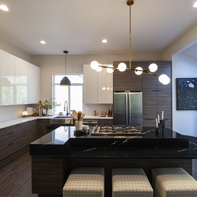
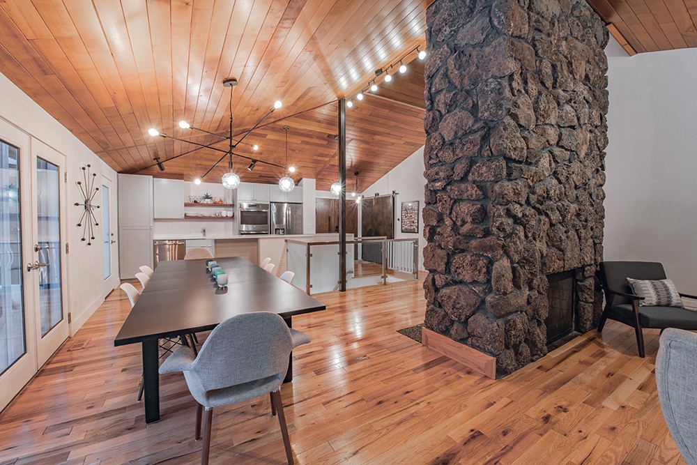
Jordan and Kristen Piscopo had found an interesting home in Spokane's Rockwood area — a neighborhood they loved. But they were concerned about the home's non-traditional interior. The dramatic but dated main floor was notable for a dark, cramped kitchen that appeared to be almost an afterthought in the original design and a quirky living area, complete with a groovy carpeted conversation pit.

Built in 1972, the home had not been significantly altered in the intervening decades.
"The original state of it was certainly not ideal," says designer Aileen Maeve Link, owner of Ollie & Maeve, who walked through the home with the Piscopos before they purchased it. "But you could just tell that it had amazing potential."
The Piscopos made the leap, buying the home and immediately beginning renovations. The first thing to go was the wall separating the kitchen from the rest of the main floor.
"They love to entertain and they love to gather friends so that was just not going to work for them," says Link. "So we blew out an entire wall."
Getting rid of the wall (and even adding a window) proved transformative, with natural light flooding the space for the first time.
"When we took that wall out, the ceiling became this huge plane that your eye just went to. We loved the wood ceiling," says Link.
The wood ceiling would stay, and the homeowners were tempted to preserve the conversation pit as well.

"We talked about doing something really cool," says Link, "Could we leave it and refinish it and make it this really cool, loungy thing around the fireplace? But ultimately, we decided to raise the floor... I'm glad we did because the upstairs just flows so nicely and the fireplace is the anchor of it all."
Preserving the lava rock fireplace was a tougher call for the homeowners. "Lava rock is so inherent to Spokane," says Link. "It's definitely one of those materials that people either love or hate. It was not well-received by the homeowners at first, and they really wanted to either paint it or resheath it with some new finish."
It took some persuasion, but the Piscopos agreed to let the renovation proceed without altering the fireplace, to see if it could fit into the new design. "We added a pretty chunky wood mantel to it, but other than that we didn't really touch the fireplace, and they are really happy that we left it because it is a cool thing that is unique to Spokane," says Link. "When it was surrounded by dated, quirky funky things, I think it made itself a little unwelcome. Now, they love it."

In the kitchen, at the suggestion of their designer, the homeowners opted to raise the counter height to 39 inches, from the standard 36. "We're not short people so its really nice just having it a little taller. That was something I would never have thought of," says Jordan.
The renovation was completed just a week before the Piscopo's son was born. "Living through a renovation whether you have a child or not, it's always stressful," says Kristen. "But then I feel like the further away you get from the project, you're like, 'Oh, that wasn't so bad. I'd do it again.'"
Taking a chance on a unique home is something that comes naturally to Link. "Every house deserves a chance. There's almost not a house, that if I go drive in a neighborhood, that I don't think has potential," she says. "We really didn't change the bones of this house. It was more of a finish update. The inherent intent of that house is completely still there, which I think is really beautiful and really cool."
DESIGNER TIPS

Celebrate native materials
"Rather than removing all of the finishes that may seem an eyesore, celebrate the ones that are unique to your local surroundings. Their distinctive character will pop and modernize when placed adjacent to a refreshed and neutral background."
Hit refresh
"If the maroon carpet, green appliances and lavender walls are keeping you from seeing a diamond in the rough, think of fairly simple, cost-effective solutions. Some homes don't need a true renovation. New flooring and paint can be just the refresh needed to bring your home back to life."
Every home should reflect your own unique identity
"Select pieces and finishes that represent who you are. They can make a bold statement and communicate the type of life you lead — think artifacts collected on travels, that comfy high-back chair, patterned tile that celebrates your joyful personality. Every square inch of your home can beautifully depict your life."
Layering and contrast are some of the easiest ways to bring depth and add visual interest to your space
"Introduce contrasting complexions through your wall color and ceiling material: A wood ceiling adjacent to bright white walls brings the right amount of pop and allows the wood ceilings to be the true showstopper of the living space."
— AILEEN MAEVE LINK, Ollie & Maeve

FROM A STALLED RENO TO A QUICK SALE
Design Challenges
- Homeowner's DIY reno plan had stalled
- Dysfunctional kitchen
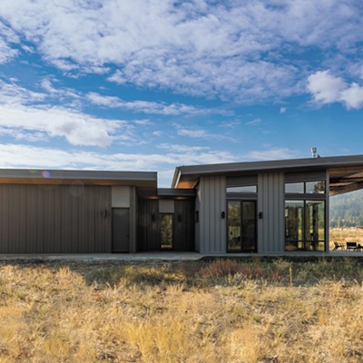
Scott Hedin was working on a plan to update the distinctive 1983 house he had bought in 2004. The hillside home featured a unique catwalk leading to the front door, while the precipitous drop-off of land behind the home offered soaring bird's eye views of the treed yard from the wall of windows along the back of the house.

Inside, though, flooring was torn out, and Hedin's reno plans were bogged down. "I tried to do all the design myself," he notes. "After about two months, the house remained demo'd with no game plan. Because of the unique architecture, I just could not get the design right."
Designer Shaleesa Mize, owner of Little Pacific Design Studio, got the call to rescue the project.
"His goal when he contacted me was to renovate and do some updates for flooring throughout," she recalls, "and he wanted to do a quick flip of the kitchen — basically painting the cabinets, updating the appliances and leaving it as is."

But when Mize checked out the space, she knew right away there were more extensive issues. "The kitchen was horrible. It was tiny. It was blocked in. It was really non-functional," she says.
The first thing that had to go was the wall separating the kitchen from the living area. Losing the wall allowed natural light to flood the space, and opened up views of the trees. It also created space for a nine-foot kitchen island, with extensive storage on front and back, adding significant function to the kitchen while basically maintaining the original footprint. A three-dimensional, white tile for the backsplash offered a neutral look, yet was still a creative departure from common white subway tile.

"We kept with a really simple palette just to let the architecture stand out," says Mize, who opted for wood flooring in tones that tie in with the home's feature wood ceilings, and replaced wood indoor railings with metal ones to tie into existing metal rails on the home's porch and deck.
This project was unique, because about a fourth of the way through, Hedin's plans changed. Rather than live in the house, he decided to sell it when the renovation was complete in order to live closer to his parents.
Though it might have been tempting going forward to compromise on the quality of finish choices, Mize didn't recommend it. "A lot of flip homes are done with that generic look that you see all over Pinterest. It's just something that is so bland that it is becoming almost the new builder's grade. [Buyers] are saying, 'Am I just going to tear out this kitchen that somebody just put in to make a quick dime?' There's definitely challenges in making it something that has been thought out and well-designed, but also not blowing the budget, when you're just going to be selling it."
Hedin went with Mize's vision. "She helped me see the greater potential provided we used high-end finishes."
Their efforts were rewarded. The home sold the first weekend it was on the market, at higher than list price. "The finishes paid for themselves, and more," says Hedin.

Designer Tips
Consider the functionality of the space
"It's important to consider the fact that an impractical space, no matter how pretty, is always going to be seen as impractical. You must repair the root problem. Designers often follow the famous quote by architect Louis Sullivan, 'Form follows function,' meaning the aesthetics are secondary to how something needs to work."
Respect the style of the home
"Taking a closer look at the home's inherent charm can be a great starting point in influencing the interior finishes for a remodel. Style can still be timeless and appropriate for a large population, but it doesn't have to be the same old thing we see just about everywhere online these days."
Factor in the quality and durability of materials
"Buyers are expecting a certain level of quality if a home is being marketed as 'recently remodeled.' You don't have to spend top dollar to renovate your home, but in my opinion, don't even bother investing time and money into something if you are going to put in cheap, low-grade materials."
— SHALEESA MIZE, Little Pacific Design, Co.