The green, white and blue doesn't flap and snap in the breeze high above the streets anywhere in downtown Spokane. Not in front of City Hall; not in Riverfront Park.
The little-known emblem of our fair city doesn't even show itself inside the dim, outdated lobby of 808 W. Spokane Falls Blvd. Nor does it proudly hang in the gray City Council chambers below, beside Mr. Washington's green glow and Old Glory's stars and stripes. No, the vexillological symbol of sunny Spokane is relegated to a position of low prominence in a space most Spokanites likely won't ever set foot, inside a City Hall conference room, where it drapes in soft folds from a bronze pole. And although Mayor David Condon made an effort to reintroduce residents to its forgotten fabric early in his term, its symbology is still largely unknown.
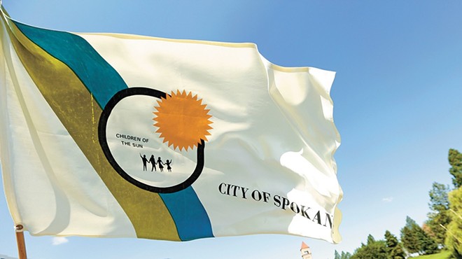
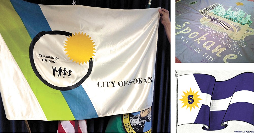
The official municipal flag of Spokane has been designed a surprising three times, perhaps becoming less revered and celebrated by its citizens with each refresh. Today's version has been in use since 1975, when then-Spokane Mayor David Rodgers decided the previous version was unsuitable and outdated. Local artist and designer Lloyd L. Carlson, whose most recognizable work is the Expo '74 mobius logo, took on the challenge. A white field is split on the left side by a wide, diagonal blue and green stripe. On the right, it proclaims "City of Spokane," and just off center, a black ring is overlaid with a golden sun. Inside the ring, a grouping of blocky stick figures wave beneath the English translation of Spokane in the Salish language: "Children of the Sun."
Before the flag's current nod to Expo, a Spokane businessman with civic pride proposed a redesign to replace an original flag introduced back in 1912. S. Luther Essick served as Chamber of Commerce president, president of the Lilac Festival Association, and wrote what was at the time Spokane's official song, "The Song of Sunny Spokane."
Essick's lilac-hued banner served as the official flag from 1958-75, including the entirety of Expo '74. In its center, a nod to the iconic Monroe Street Bridge and the Spokane River beneath, framed by a spray of lilac blossoms and a city skyline. Perhaps the only remaining banner of that design in existence today is in the possession of Essick's daughter, Joyce DiStefano, 84. Signatures in deep purple ink flood the fabric borders: honored local members of the military, Miss Spokane women, city council members, Spokane's sister city delegations, Richard Nixon and even Buzz Aldrin.
"I don't know what was behind it, but he was constantly thinking of what he could do for the city," DiStefano recalls from the living room of her North Spokane home, a portfolio of newspaper clippings about her father's flag sitting in her lap. "Because he was so involved, I think that was the inspiration, plus he just wanted to leave a legacy."
Some U.S. cities have invariably recognizable flags. Take Chicago, for example. The Windy City's flag is considered by vexillologists — those who study the design and history of flags — to be the epitome of good flag design: it's simple, symbolic and distinctive. A child could draw it from memory. Chicago tourists can go to any gift shop and elements of its flag are everywhere, explains Roman Mars, host of the design-centric radio show 99% Invisible, during a recent TED Talk called "Why city flags might be the worst-designed thing you've never noticed."
If vexillologists were to critique Spokane's three flag versions, they'd likely praise the city's first, created as the result of a contest overseen by the Spokane Ad Club. Three Spokane residents' ideas for the first official flag were combined to create a final design. A geometric field of navy and white, the flag's leftmost side features a 16-pointed sunburst inside of which a single 'S' in navy blue is placed. The look is uncomplicated, memorable and emblematic.
An unbylined editorial in the Spokane Daily Chronicle from Aug. 2, 1912, states: "A new flag waves in the western breezes — a flag of peace, yet of never-ending conquest. Over the greater Spokane which is emerging from the hopes, the dreams, the struggles of today is to float a bright, beautiful banner of blue and white and gold — emblem and inspiration for a grander, better city, ever moving forward and upward, season by season, century by century."
If only its writer could know we'd set aside and quickly forget this once profound icon, which was proudly displayed at community gatherings, during parades and ceremonies, and was even sent as a gift of goodwill to other cities across the country.
The only known original production of Spokane's first flag is rolled up in massive sheets of tissue paper, inside the basement archives of the Northwest Museum of Arts and Culture. The stiff white fabric is yellowed and dirt-smudged, and moths have nibbled a few ragged holes in the navy wool.
At each flag's unveiling and in the recent years following their respective debuts, it's romantic to assume that Spokane's people were filled with a refreshing surge of civic pride. But now that each has mostly been forgotten, except to those with a sincere fascination for their symbology — whether due to family ties, historical appreciation or mayoral duty — is it time for redo number four?
This time, though, let it be final, and let's wave Spokane's colors proudly and often. ♦